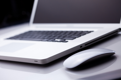
Possible plan for a front cover image for my magazine
For the run up to the preliminary activity, in preparation, I have considered the possible options for a professional looking front cover main image. In the wake of the deadline, I have come up with a plan for the main image for the magazine front cover.
The plan is as follows:
- A three-quarter medium close up shot
- The use of the Apple iMac's as the focal point
- Using the room of W9A as a setting
- Use of the depth of field aspect.
- A possible actor's hand
Here are some sample images in which I can take inspiration from:


I'm on the fence about this, while more customization is good, I have a feeling this is a "in-progress" update, it just feels incomplete and half-way there.
ReplyDeleteWe use badge layout for apps on design approvals (visual projects), so the image being displayed is important. Old layout "feels like" it had larger images,
maybe because the images were cropped more loosely so it's easier to tell which project it was at quick glance. Now the image is cropped closer, making it
harder to scan thru at quick glance. I find myself needing to click into the project more often than usual. Which makes the whole user experience less
efficient.
I have a couple suggestions that might make it work better:
1. Increase the height of the window the cover image is being displayed.
2. Let us to choose which image to be displayed as "cover" (like how Pinterest handles cover images of each board, was hoping for this for a long time)
3. Let us adjust which part of the image to show and how tight or loose the crop is (with a fixed window, let us move the image around and maybe enlarge or
shrink it to control what shows thru the window. Pinterest does a limited form of this, which is very useful in making the cover image relevant)
4. Allow Cover Image to be ordered in different hierarchy (currently every element can be ordered differently except the Cover Image, it seems to be stuck
in the 2nd spot, would like the option to set it on another spot in the layout. This one seems like an easy fix, since you guys allow that for every other
element already)