
Wednesday 26 October 2016
Monday 24 October 2016
Identifying the conventions of contents pages

These are the content pages found in various issues of the Kerrang magazine, which is a music magazine specialising in the Rock genre. From the collage above, several common conventions can be identified in relation to the creation of a contents page. After looking at collage, it is evident that the discourse structure used within the composition of the page revolves around a contents banner (which is placed at the top in a bold, distorted sans-serif font; featuring the date and masthead) and several article-related pictures which is placed either on the left or the right; this is then followed by the body of text containing conventions such as: page numbers, descriptions (also known as blurbs) and titles of articles (usually placed with bold text). It is also evident that the colour yellow is used frequently, which may reflect the brand of the magazine and the genre it is covering; the colour yellow may act as a theme of the magazine due to the colour being used so frequently. At the bottom the contents pages appears to be editor's notes or information, with subscription information. In terms of the font size, it appears that fonts no bigger than 28 pt and no smaller than 10 pt has been used.

Above is a collage of front covers for Kerrang magazine. Similar to the contents pages, the front covers follow a certain discourse structure in terms of visual layouts, syntax and colour - in which make the house style and brand image for the magazine. However, the front covers of Kerrang use different fonts at different sizes with differences in colour; mainly to appeal to the target audience and to stand out on the shelves. The common conventions used on the front covers consist of: main image, masthead (usually behind the main image), pugs, banners, strap lines, headline and cover lines respectively. All of the front covers feature large main images in which take up majority of the A4 space; this is so they can be seen by the audience and act as a visual lead in for the fans. In addition, all covers feature a pug offering content such as posters or the chance to win tickets - these things appeal to the target audience. In terms of headlines, they are presented in big bold sans serif fonts, all which possess a distorted look which reflects the genre. Unlike the contents page where the colour yellow is commonly used, the front cover of the magazines have different colour schemes relating to which band/artist is on the front cover - this may reflect their personality or the their type of music.
Sunday 23 October 2016
My final contents page

This is my final contents page, in which I made in Sketch with all of the portrayed media conventions
Friday 21 October 2016
Content page layout sketches

These are my six contents page layout sketches which I designed in order to get an idea of how my final magazine cover would look. All of these layout sketches contain the appropriate conventions at the appropriate degree, and I feel it is enough information to draw my target audience in. Even for the sparser ones, the main image used on that front cover will hopefully be sufficient enough to supply the correct information.
On all six layout sketches, the visual syntaxes...
Tuesday 18 October 2016

Monday 17 October 2016
Rule of thirds explained
The rule of thirds is a photography technique which considers framing and position of a subject or focal in a picture. This technique involves the splitting of a viewfinder into thirds, essentially ending up with nine different sections. This gives you four lines, which are useful to place important aspects when taking a picture.
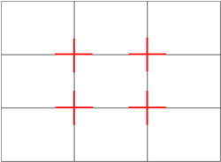 |
| This is a diagram showing the splitting on the viewfinder, with the junctions of the lines highlighted. It is said that the human eye, when looking at something, go to one of the highlighted junctions first rather than the centre. |
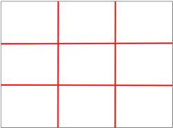 |
| This is a diagram displaying the four lines made from splitting the viewfinder into thirds, these lines are used to place the objects of interest on the lines in order to make the picture flow with natural reactions. |
 |
| This what the rule of thirds looks like when put into context. As you can see, the man is placed on the right side of the frame with his face near the top right junction. This allows the viewer to easily interpret the image and increases the flow in the shot. |
Sunday 2 October 2016
Final magazine front cover

This is my final A4 magazine front cover for my school magazine, in which I used Sketch to create the media conventions shown on the front. I have decided to include two students at computers doing work as the main image, as it fits with the main headline positioned on the left.
Saturday 1 October 2016


Subscribe to:
Posts (Atom)