
Monday 28 November 2016
Wednesday 23 November 2016
Mock up front covers for my music magazine


These are my three mock-up front covers for my music magazine front cover. Created in Sketch, these three front covers show a variety of different media conventions presented in three different layouts; these come with a variety of bright colours in which I feel represent the genre. I have used many of the common conventions used on today's magazines (barcode, cover lines, masthead etc.) in order to compete with other magazines in which possess a similar ideology. All three mock up covers illustrate the image that I want my magazine to have, and accurately do so with the type of main images chosen and the choice of fonts.
Sunday 20 November 2016
Ideology, Brand Identity and Brand Values of my own music magazine
With my name of my music magazine being VibratoPress, this magazine will be branded a magazine of the rock genre (and the songs featured within the rock charts) and will focus on both older and more recent artists. In addition, a range of different artists of different sub-genres will be included (such as punk rock and classic rock); this will be an attempt to get a wider target audience, both older and younger people. As this magazine will believe in all artists, this magazine will feature recently banded who are involved in today's music industry. In addition, this magazine will also feature more established artists in which would have or currently have a large legacy within the music industry in which will be recognised by this magazine.
This magazine will hold the genre of rock music (and it's biggest sub genres) as very important, as it will highlight the genres biggest points and represent the genre as very diverse. Furthermore, VibratoPress will periodically focus on individual members of bands (most likely guitarists; bass, lead or rhythm) such as Brian May of Queen or Steve Lukather of Toto. VibratoPress will simultaneously touch upon the musical fusion of the 1980s, where rock and pop mixed and the artists involved overlapped several charts within the decade. For example, artists such as Michael Jackson (Beat It, Dirty Diana), Lionel Richie (Dancing On The Ceiling, Running With The Night) and Whitney Houston (So Emotional) have incorporated the rock genre within their pop songs, and have both topped the charts by doing so. Because of this phenomenon, VibratoPress will have monthly articles that feature the guitarists that have worked on the track in order to recognise their work. This is also apparent in the New Wave genre, where artists such as Duran Duran and Tears For Fears, also featured guitars in their work which VibratoPress will focus on and value.
Thursday 17 November 2016
Layout sketches for my music magazine front cover

Here are my six possible layout sketches for my music magazine front cover. Within the making process of the school magazine, I have come to discover how certain visual syntaxes blend and work together on a front cover. In light of this, I have reconsidered the positions from the school magazine layout sketches as: the magazine has a different purpose, the visual syntaxes work differently to that of a school magazine.
Tuesday 15 November 2016
Plan for my music magazine photoshoot
In preparation for the photo shoot, I have researched several main images from the front covers of magazines that are within my music genre of rock. After considering the possibilities and looking at the competition, I have decided the following for my main image for my magazine:


3 images:
- one medium shot, medium long shot and a full body long shot - all of me holding a guitar.
- The medium shot will be shot against a white background, or some other to bring a contrast to the focal point. This will consist of me halfway through jumping.
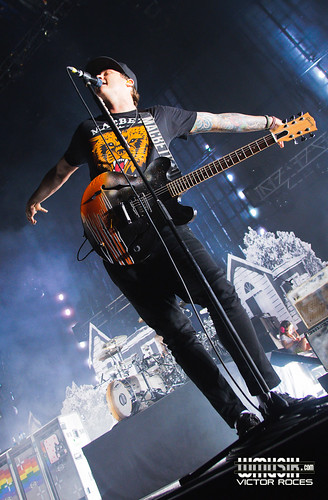
- The medium long shot will be me in a pose similar to the picture of Queen's Brian May, as show below.
- The full body long shot will be a canted, low angle shot, with the camera not too far away from my feet.

Friday 11 November 2016
Results from the masthead questionnaire
 |
Two out of the ten people I had asked chose this masthead. One of the interviewees said they liked this particular masthead due to the font which was used, which "represented the genre of rock well".
The other one had said that they liked it because the masthead was "bright and unique which will help attract [my] magazines target audience".
|
 |
| None of the interviewees chose this masthead due to its "primitive aesthetic". |
 |
| Four out of the ten people I had asked chose this masthead. Most of the interviewees complimented the name and said that it is "short and catchy" and one said that the distorted font showed "how the sound wants to break out". |
 |
| None of the interviewees chose this masthead due to its unusual mix of fonts, but they all credited the static effect. |
| None of the interviewees chose this masthead due to its monochromatic colour scheme, but some credited the text positioning. |
 |
| One of the ten people I had asked chose this masthead. This interviewee had said that they liked the mixture of fonts and the use of the colour red as it "represented the genre well". |
 |
| None of the interviewees chose this masthead due to the monochromic colour scheme. However, when I asked which one they preferred between this one and the one above, all of them chose the latter. |
 |
| None of the interviewees chose this masthead due to the length of the masthead. However, everyone who was asked approved and complimented the text effects used. |
 |
| Two of the ten people I had asked chose this masthead. Both said that they had like the name as they deemed it "catchy" and also said that the use of the red was "a perfect way to represent rock", in addition to being fond of the text effects. |
 |
| One of the ten people I had asked chose this masthead, as they said that the text arrangement is "unique and innovative" and also went on to saying that the three-dimensional effect was a "good device to draw the target audience in". |
Thursday 10 November 2016
Brand Identity and Ideology of the Kerrang Magazine

Established in 1981, the Kerrang! magazine, is a UK-based magazine devoted to the genre of rock music, presents and ideology that values and focuses on music of the modern era. The magazine focuses its contents on current rock, indie and alternative music and artists who are currently contributing to today's music industry. Like other music magazines, Kerrang! values music (especially rock and its sub genres) and how it links with people's lives. From its colour schemes, to its former slogan (Live life loud!), Kerrang! uses several visual syntaxes to symbolise the theme of live and loud music. The masthead 'Kerrang!' uses a wild font which simulates broken glass, which also links to the brand identity of loud rock music. According to Kerrang!'s demographics from Jan 2015 to Dec 2015, this magazine is mostly bought by males 15-35 years old because of the 446,000 sales. However, even though 382,000 of these sales were by males, 292,000 sales have been made from the female demographic. This means, even though its main audience is most likely male, that women also purchase this magazine - making this magazine unisex. This is the demographic that will have a passion for the genre of rock, indie or alternative music, and will feel that music is a big part of their lives. Youth is clearly valued through the image of Kerrang!, due to the vivid colours and wild design style, in addition to its subject of modern rock, alt and indie music. As shown above, Kerrang! believes in supporting not only the big names (i.e. Green Day, blink-182), but also the new, and independent artist who are fresh into the music industry. Their monthly issues come with interviews, posters, articles and reviews all of which keep their demographic busy and infatuated with their ideology. The layout and composition of the magazine clearly shows the brand's vibrancy, dynamic and broad range of feature which portray and reinforce their main target audience of 15-35 year olds, and audience which they value and supply through their relationship that they have established together through their mode of address.
Tuesday 8 November 2016


Monday 7 November 2016
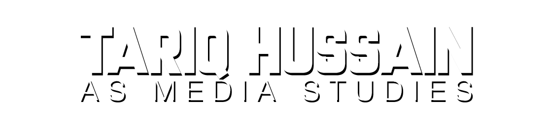
Possible mastheads for my music magazine

This is the collection of ten different mastheads which I could possibly use for my rock music magazine. Throughout these ten mastheads, I have taken in the consideration of the genre of rock and used appropriate distorted sans serif fonts. For example, I have used fonts that symbolise the wild theme of rock or the shattered glass which represents loudness. In terms of colour, I have used mostly red, black or white in my mastheads as I feel that those colours best represent the genre. As for the effects used on the mastheads, I have mostly used strokes in which have been layered on top of each other for added effect.
Thursday 3 November 2016
Introduction to my music magazine (genre, masthead names)
The genre I have chosen for my music magazine is the genre of Rock, as this is a genre I am very fond of and familiar with. I feel that if I choose a genre I like and I am familiar with, it will allow me to effectively use my interest to my advantage.
Since my music magazine is going to focus on the genre of rock music, I have decided to use the name of techniques relating to musical instruments used in rock music (e.g. guitar, drums). The possible names are as follows:
Since my music magazine is going to focus on the genre of rock music, I have decided to use the name of techniques relating to musical instruments used in rock music (e.g. guitar, drums). The possible names are as follows:
- LegatoMag
- VibratoPress
- PalmMUTE (the e will be a mute button)
- pickSLIDE!
- HARMONKIX (play on the guitar technique "Harmonics")
Subscribe to:
Posts (Atom)