
 |
| This is the base image which went through post-processing in Photoshop CC 2017 prior to the making of this double page spread, effects such as monochrome gradient maps, brightness/contrast adjustments and others were applied to achieve this effect. |
 |
| This is stage 1 of the development process, where the title of the article was added. Two sans serif fonts were used (Bebas Neue and Hard Rock Kids) in order to achieve an appropriate aesthetic; different typefaces of the fonts were used to illustrate the contrast between pop and rock genres. |
 |
| This is stage 2 of the development process, consisting of a change of fonts. Due to the previous font being slightly illegible, I decided to change it to a font with a similar theme but more legible - leaving me with a new font. |
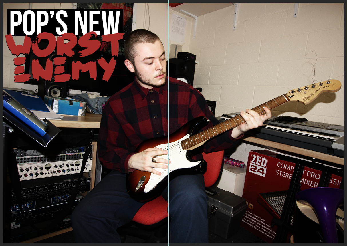 |
| This is stage 3 of the developmental process. Albeit very small, a black rectangle was added behind the white text in order to create differentiation between the text and the background. |
 |
| This is stage 4 of the developmental process. In this stage, two aspects of page furniture were added to construct the overall look of the double page spread. These are the subheading, folio and slug respectively. |
 |
| This is stage 5 of the developmental process. In this stage, the article was added in a white variant of Helvetica Neue with a hard drop shadow behind it in order to make it visible against the background. As you can see, spacing was made for the drop caps. |
 |
| This is stage 6, which involved the insertion of the drop caps - both in rectangles with a strong serif font. |
 |
| This is a screenshot showing the process involving sharpening the image in order to make it stand out more. To do this, an Unsharp Mask was used in order to bring out the finer details within the image. |
 |
| This is a screenshot of the process involving adjusting the levels of the image. Just like the contents page, Photoshop's levels algorithms were used in order to add contrast between the darker and lighter shades. |
 |
| However, I didn't feel the algorithm chosen was appropriate for the main image thus I changed it to another in order to bring the highlights down slightly. |
 |
| A subtle brightness adjustment was made to the main image. |
 |
| In order to expand the conventional repertoire of featured page furniture, I decided to add in a pull quote - with accented words in the vivid-most colour in the image which happened to be the red of the chair. |
 |
| As you can see in the screenshot, there are some inappropriate gaps in the text which spoils the alignment. Guidelines were also used in order to maintain equal spacing and sizing of the paragraph. |
 |
| This is the finished result, as you can see the alignment has been fixed and the drop cap has been resized - improving the alignment of the text. In addition, the inequalities regarding the other paragraphs were fixed as well - meaning that any oversized or undersized paragraphs were resized to be equal as seen on the final product. |
No comments:
Post a Comment